Information-heavy design
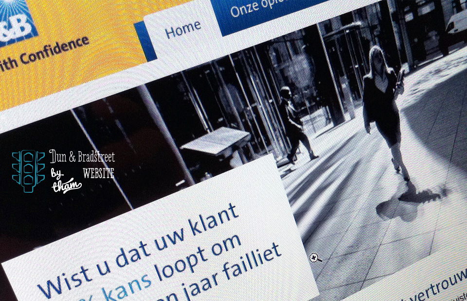
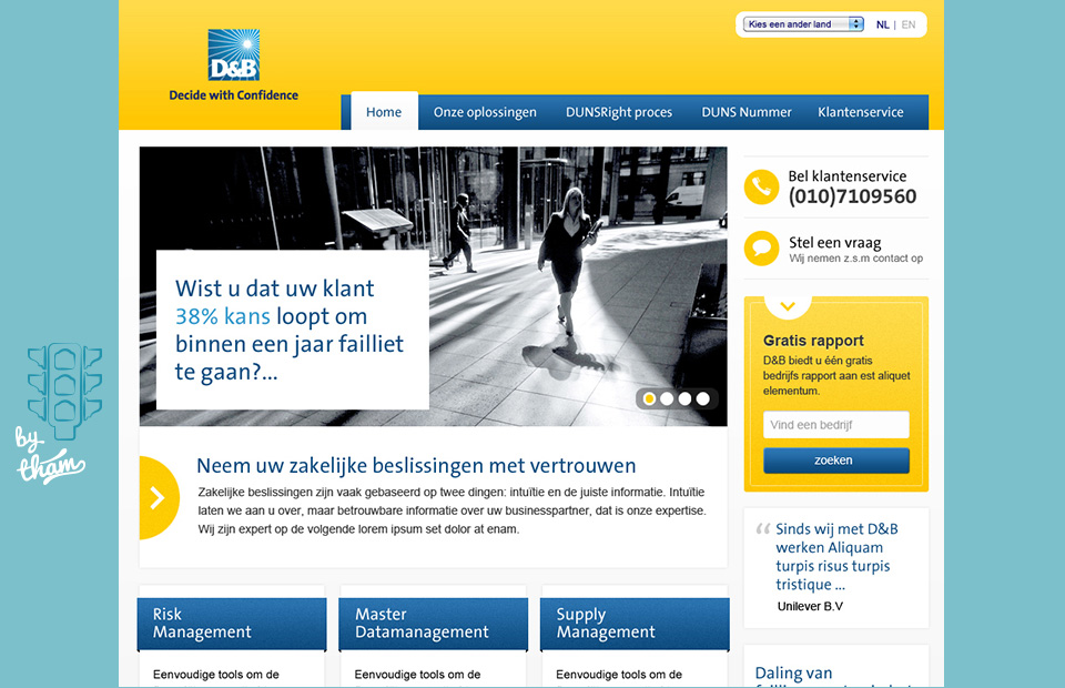
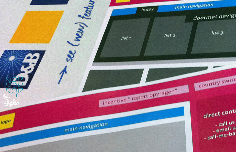
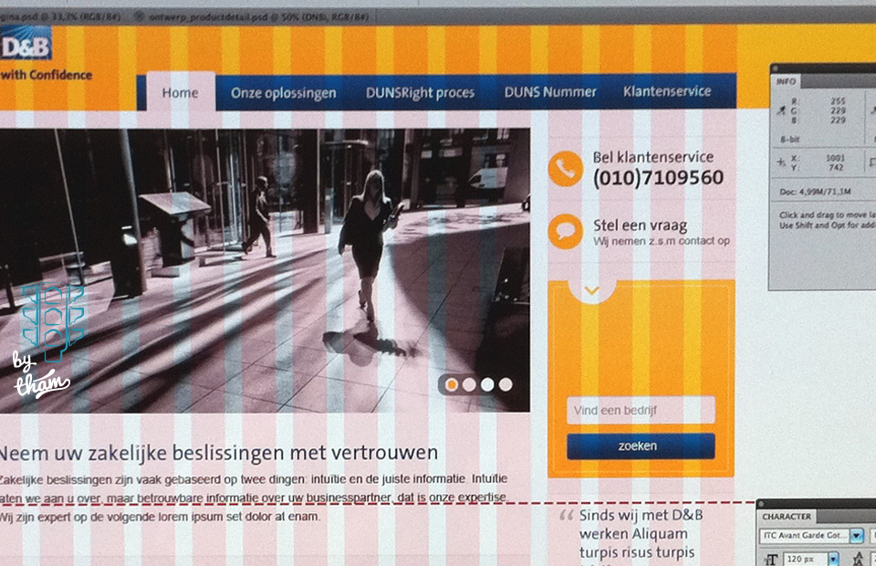
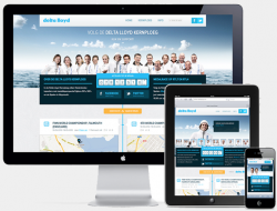
D&B wanted a website that integrated all their different products in one logical website. It needed a whole new structure that is easy to manage, yet totally customized to the brand specifications.
year:
2011
project:
Dutch country website
services:
front-end development, interaction design, information architecture
deliverables:
content audit, wireframes
employer:
Mangrove
client:
Dun & Bradstreet NL
website:
Tags: Dun & Bradstreet, Mangrove
